Помогите с реализацией лоадера:
Алеша, зачем вам круглый лоадер? Выделяйтесь, не будьте как все. Пусть у всех будет круглый, а у вас квадратный:
var num = document.getElementById("num");
var percent = num.innerText;
var interval;
interval = setInterval(function() {
  percent++;
  num.innerHTML = percent + '<span>%</span>';
  if (percent == 100) {
    clearInterval(interval);
  }
}, 100);
.container {
position: relative;
width: 140px;
padding-top: 140px;
border: 20px solid #dfe8ed;
}
.load__l {
position: absolute;
top: -20px;
left: -20px;
width: calc(100% + 20px);
height: calc(100% + 20px);
border-top: 20px solid #d74680;
border-right: 20px solid #d74680;
opacity: 1;
animation: 5s linear load__l;
}
.load__r {
position: absolute;
bottom: -20px;
right: -20px;
width: calc(100% + 20px);
height: 100%;
border-bottom: 20px solid #d74680;
border-left: 20px solid #d74680;
opacity: 1;
animation: 10s linear load__r;
}
@keyframes load__l {
0% {
width: 0;
height: 0;
opacity: 0;
}
0.1% {
opacity: 1;
}
50% {
width: calc(100% + 20px);
height: 0;
opacity: 1;
}
100% {
width: calc(100% + 20px);
height: calc(100% + 20px);
opacity: 1;
}
}
@keyframes load__r {
0%,
50% {
width: 0;
height: 0;
opacity: 0;
}
50.1% {
opacity: 1;
}
75% {
width: calc(100% + 20px);
height: 0;
opacity: 1;
}
100% {
width: calc(100% + 20px);
height: 100%;
opacity: 1;
}
}
#num {
position: absolute;
top: 0;
left: 0;
width: 100%;
height: 100%;
line-height: 140px;
text-align: center;
font-size: 40px;
font-family: monospace;
}
#num span {
font-size: 28px;
padding-left: 4px;
}
<div class="container">
  <div class="load__l"></div>
  <div class="load__r"></div>
  <div id="num"></div>
</div>
Или ромбовидный:
var num = document.getElementById("num");
var percent = num.innerText;
var interval;
interval = setInterval(function() {
  percent++;
  num.innerHTML = percent + '<span>%</span>';
  if (percent == 100) {
    clearInterval(interval);
  }
}, 100);
.container {
position: relative;
width: 140px;
padding-top: 140px;
border: 20px solid #dfe8ed;
margin: 40px 0 0 40px;
transform: rotate(45deg);
}
.load__l {
position: absolute;
top: -20px;
left: -20px;
width: calc(100% + 20px);
height: calc(100% + 20px);
border-top: 20px solid #d74680;
border-right: 20px solid #d74680;
opacity: 1;
animation: 5s linear load__l;
}
.load__r {
position: absolute;
bottom: -20px;
right: -20px;
width: calc(100% + 20px);
height: 100%;
border-bottom: 20px solid #d74680;
border-left: 20px solid #d74680;
opacity: 1;
animation: 10s linear load__r;
}
@keyframes load__l {
0% {
width: 0;
height: 0;
opacity: 0;
}
0.1% {
opacity: 1;
}
50% {
width: calc(100% + 20px);
height: 0;
opacity: 1;
}
100% {
width: calc(100% + 20px);
height: calc(100% + 20px);
opacity: 1;
}
}
@keyframes load__r {
0%,
50% {
width: 0;
height: 0;
opacity: 0;
}
50.1% {
opacity: 1;
}
75% {
width: calc(100% + 20px);
height: 0;
opacity: 1;
}
100% {
width: calc(100% + 20px);
height: 100%;
opacity: 1;
}
}
#num {
position: absolute;
top: 0;
left: 0;
width: 100%;
height: 100%;
line-height: 140px;
text-align: center;
font-size: 40px;
font-family: monospace;
transform: rotate(-45deg);
}
#num span {
font-size: 28px;
padding-left: 4px;
}
<div class="container">
  <div class="load__l"></div>
  <div class="load__r"></div>
  <div id="num"></div>
</div>
Алеша, зачем вам круглый лоадер? Посмотрите, какой интересный вариант я вам предлагаю. Такого точно нет ни у кого, только у вас будет:
var num = document.getElementById("num");
var percent = num.innerText;
var interval;
interval = setInterval(function() {
  percent++;
  num.innerHTML = percent;
  if (percent == 100) {
    clearInterval(interval);
  }
}, 97);
.container {
position: relative;
width: 100%;
max-width: 600px;
height: 130px;
}
#num {
position: absolute;
top: -35px;
left: 40%;
font-size: 50px;
font-weight: bold;
font-family: monospace;
transform: rotate(-18deg);
color: #d74680;
animation: 9.7s linear percent;
}
.container:before {
content: "00";
display: block;
position: absolute;
top: -41px;
left: 57%;
font-size: 100px;
font-weight: bold;
font-family: monospace;
letter-spacing: 27px;
color: #d74680;
transform: rotate(-70deg);
zoom: 1;
animation: 9.7s linear percent;
}
@keyframes percent {
0% {
color: #dfe8ed;
zoom: 1;
}
98.999% {
color: #d74680;
zoom: 1;
}
99% {
color: #dfe8ed;
zoom: 1.1;
}
99.999% {
color: #d74680;
zoom: 1;
}
100% {
color: #d74680;
zoom: 1;
}
}
.loader {
position: relative;
overflow: hidden;
width: 100%;
max-width: 600px;
height: 60px;
margin: 0 auto;
margin-top: 70px;
background-color: #dfe8ed;
-webkit-clip-path: polygon(2px 40px, 20% 0, 40% 40px, 60% 0, 80% 40px, calc(100% - 8px) 0, 100% 16px, 80% 60px, 60% 20px, 40% 60px, 20% 20px, 10px 57px);
clip-path: polygon(2px 40px, 20% 0, 40% 40px, 60% 0, 80% 40px, calc(100% - 8px) 0, 100% 16px, 80% 60px, 60% 20px, 40% 60px, 20% 20px, 10px 57px);
}
.load {
position: absolute;
top: 0;
left: 0;
width: 100%;
height: 100%;
background-color: #d74680;
animation: 10s linear load;
}
@keyframes load {
0% {
width: 0;
}
100% {
width: 100%;
}
}
.load:after {
content: "";
display: block;
position: absolute;
top: 0;
right: -50px;
width: 60px;
height: 60px;
background-color: #d74680;
animation: 10s linear load__after;
-webkit-clip-path: polygon(0 0, 50% 0, 100% 100%, 0 100%);
clip-path: polygon(0 0, 50% 0, 100% 100%, 0 100%);
}
@keyframes load__after {
0% {
-webkit-clip-path: polygon(0 0, 50% 0, 100% 100%, 0 100%);
clip-path: polygon(0 0, 50% 0, 100% 100%, 0 100%);
}
14.5% {
-webkit-clip-path: polygon(0 0, 50% 0, 100% 100%, 0 100%);
clip-path: polygon(0 0, 50% 0, 100% 100%, 0 100%);
}
15.5% {
-webkit-clip-path: polygon(0 0, 100% 0, 50% 100%, 0 100%);
clip-path: polygon(0 0, 100% 0, 50% 100%, 0 100%);
}
34.5% {
-webkit-clip-path: polygon(0 0, 100% 0, 50% 100%, 0 100%);
clip-path: polygon(0 0, 100% 0, 50% 100%, 0 100%);
}
35.5% {
-webkit-clip-path: polygon(0 0, 50% 0, 100% 100%, 0 100%);
clip-path: polygon(0 0, 50% 0, 100% 100%, 0 100%);
}
54.5% {
-webkit-clip-path: polygon(0 0, 50% 0, 100% 100%, 0 100%);
clip-path: polygon(0 0, 50% 0, 100% 100%, 0 100%);
}
55.5% {
-webkit-clip-path: polygon(0 0, 100% 0, 50% 100%, 0 100%);
clip-path: polygon(0 0, 100% 0, 50% 100%, 0 100%);
}
74.5% {
-webkit-clip-path: polygon(0 0, 100% 0, 50% 100%, 0 100%);
clip-path: polygon(0 0, 100% 0, 50% 100%, 0 100%);
}
75.5% {
-webkit-clip-path: polygon(0 0, 50% 0, 100% 100%, 0 100%);
clip-path: polygon(0 0, 50% 0, 100% 100%, 0 100%);
}
100% {
-webkit-clip-path: polygon(0 0, 50% 0, 100% 100%, 0 100%);
clip-path: polygon(0 0, 50% 0, 100% 100%, 0 100%);
}
}
<div class="container">
  <div class="loader">
    <div class="load"></div>
  </div>
  <div id="num"></div>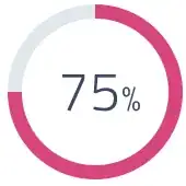
</div>Круглый, как вы просили:
const numb = document.getElementById('count')
let counter = 0
setInterval(() => {
    if (counter === 100) {
        clearInterval()
    } else {
        counter += 1
        numb.textContent = counter + '%'
    }
}, 50)
<svg viewbox="0 0 100 100">
<path fill="none"
stroke-linecap="round"
stroke-width="5"
stroke="#dfe8ed"
stroke-dasharray="251.2,0"
d="M50 10 a 40 40 0 0 1 0 80 a 40 40 0 0 1 0 -80"
/>
<path fill="none"
stroke-linecap="round"
stroke-width="5"
stroke="#d74680"
stroke-dasharray="251.2,0"
d="M50 10 a 40 40 0 0 1 0 80 a 40 40 0 0 1 0 -80"
>
<animate attributeName="stroke-dasharray" from="0,251.2" to="251.2,0" dur="5s"/>
</path>
<text id="count" x="50" y="50" text-anchor="middle" dy="7" font-size="20" font-family="arial">
100%
</text>
</svg>