Как можно нарисовать такую дугу?
Решение с использованием stroke-dasharray и stroke-dashoffset
Идея заключается в том, чтобы показывать только часть окружности, а остальную часть скрывать пробелом stroke-dasharray ="314 314"
Первая цифра это - длина штриха, вторая цифра - длина пробела.
Эти цифры выбраны не случайно, - так как длина окружности при радиусе 100px равна:
c = 2*P*R = 628px
Для окружности SVG считает началом пути положительную ось X-ов. Но нам надо рисовать от оси Y-ов. Поэтому поворачиваем нашу окружность против часовой стрелки на 90 градусов
<g transform="rotate(-90 150 150)">
<svg version="1.1"
     baseProfile="full"
     xmlns="http://www.w3.org/2000/svg"
     xmlns:xlink="http://www.w3.org/1999/xlink"
      width="400" height="400">
 <rect width="100%" height="100%" fill="#1F2024" />
 <g transform="rotate(-90 150 150)">
   <circle id="fon" cx="150" cy="150" r="100" stroke="#673E93" stroke-width="5"   stroke-dasharray ="314 " stroke-dashoffset="314" fill="none" />
</g>
<line x1="150" y1="240" x2="150" y2="290" stroke="white" stroke-width="2" />
</svg>
Далее делаем расчет длины для зеленой (R=115px) и синей окружностей (R=130px)
Для зеленой длина окружности равна = 722px
Для синей окружности равна = 816px
<svg version="1.1"
     baseProfile="full"
     xmlns="http://www.w3.org/2000/svg"
     xmlns:xlink="http://www.w3.org/1999/xlink"
      width="400" height="400">
 <rect width="100%" height="100%" fill="#1F2024" />
 <g transform="rotate(-90 150 150)" fill="none" stroke-width="5">
    <circle id="fon" cx="150" cy="150" r="100" stroke="#673E93"  stroke-dasharray ="314 " stroke-dashoffset="314" />
    <circle  cx="150" cy="150" r="115"  stroke="#05957A"    stroke-dasharray ="365 " stroke-dashoffset="360"  />
    <circle  cx="150" cy="150" r="130"  stroke="#0F72AF"    stroke-dasharray ="408.2 428" stroke-dashoffset="488" />
    </g>
<line x1="150" y1="240" x2="150" y2="290" stroke="white" stroke-width="2" />
 </svg>
Далее необходимо добавить три четверти окружностей с радиусами:
100px, 115px 130px
Идея та же - используем атрибут stroke-dasharray ="157 471" , где
157 - длина штриха, равная одной четверти длины окружности при радиусе равном - 100px
471 - длина пробела равная 3/4 длины окружности
для двух других окружностей с большими радиусами цифры будут другие. Полная длина окружности вычисляется по формуле - C = 2*P*R
<svg version="1.1"
baseProfile="full"
xmlns="http://www.w3.org/2000/svg"
xmlns:xlink="http://www.w3.org/1999/xlink"
width="400" height="400">
<rect width="100%" height="100%" fill="#1F2024" />
<g fill="none" stroke-width="10" stroke="#2A2D2F">
<circle id="gray100" cx="150" cy="150" r="100" stroke-dasharray ="157 471 " />
<circle id="gray115" cx="150" cy="150" r="115" stroke-dasharray ="180.5 541 " />
<circle id="gray130" cx="150" cy="150" r="130" stroke-dasharray ="204.1 612 " />
</g>
<g transform="rotate(-90 150 150)" fill="none" stroke-width="6">
<circle id="fon" cx="150" cy="150" r="100" stroke="#673E93" stroke-dasharray ="314 " stroke-dashoffset="314" />
<circle cx="150" cy="150" r="115" stroke="#05957A" stroke-dasharray ="365 " stroke-dashoffset="360" />
<circle cx="150" cy="150" r="130" stroke="#0F72AF" stroke-dasharray ="408.2 428" stroke-dashoffset="488" />
</g>
<line x1="150" y1="240" x2="150" y2="290" stroke="white" stroke-width="2" />
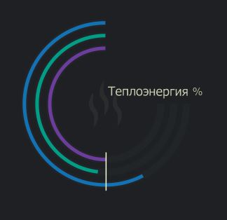
<text font-size="20" font-family="Verdana" x="155" y="140" stroke="#999B98" fill="#999B98"> Теплоэнергия % </text>
</svg>
Для анимации совместно используются атрибуты stroke-dasharray и stroke-dashoffset
На каждый атрибут применена отдельная анимация изменения параметров от нуля до максимального значения - values="0;314"
Запуск анимации происходит по клику на svg изображении - begin="svg1.click"
Анимации цветных кругов идут последовательно друг за другом
Например: условием запуска зелёного круга является окончание анимации пурпурного круга, плюс пауза 0.25s
begin="purle1.end+0.25s"
<svg id="svg1" version="1.1"
baseProfile="full"
xmlns="http://www.w3.org/2000/svg"
xmlns:xlink="http://www.w3.org/1999/xlink"
width="400" height="400">
<rect width="100%" height="100%" fill="#1F2024" />
<g fill="none" stroke-width="10" stroke="#2A2D2F">
<circle id="gray100" cx="150" cy="150" r="100" stroke-dasharray ="157 471 " />
<circle id="gray115" cx="150" cy="150" r="115" stroke-dasharray ="180.5 541 " />
<circle id="gray130" cx="150" cy="150" r="130" stroke-dasharray ="204.1 612 " />
</g>
<g transform="rotate(-90 150 150)" fill="none" stroke-width="6">
<circle id="fon" cx="150" cy="150" r="100" stroke="#673E93" stroke-dasharray ="314 " stroke-dashoffset="314" >
<animate id="purle" attributeName="stroke-dasharray" begin="svg1.click" values="0;314" dur="5s" repeatCount="1" fill="freeze" calcMode="linear" restart="whenNotActive"/>
<animate id="purle1" attributeName="stroke-dashoffset" begin="svg1.click" values="0;314" dur="5s" repeatCount="1" fill="freeze" calcMode="linear" restart="whenNotActive"/>
</circle>
<circle cx="150" cy="150" r="115" stroke="#05957A" stroke-dasharray ="365 " stroke-dashoffset="360" >
<animate id="green" attributeName="stroke-dasharray" begin="purle1.end+0.25s" values="0;365" dur="5s" repeatCount="1" fill="freeze" calcMode="linear" restart="whenNotActive"/>
<animate id="green1" attributeName="stroke-dashoffset" begin="purle1.end+0.25s" values="0;365" dur="5s" repeatCount="1" fill="freeze" calcMode="linear" restart="whenNotActive"/>
</circle>
<circle cx="150" cy="150" r="130" stroke="#0F72AF" stroke-dasharray ="408.2 428" stroke-dashoffset="488" >
<animate id="blue" attributeName="stroke-dasharray" begin="green1.end+0.25s" values="408;0;408" dur="5s" repeatCount="1" fill="freeze" calcMode="linear" restart="whenNotActive"/>
<animate id="blue1" attributeName="stroke-dashoffset" begin="green1.end+0.25s" values="488;0;488" dur="8s" repeatCount="1" fill="freeze" calcMode="linear" restart="whenNotActive"/>
</circle>
</g>
<line x1="150" y1="240" x2="150" y2="290" stroke="white" stroke-width="3" />
<line x1="152" y1="16" x2="152" y2="60" stroke="white" stroke-width="3" />
<text font-size="20" font-family="Verdana" x="155" y="140" stroke="#999B98" fill="#999B98"> Теплоэнергия % </text>
</svg>
Как это делаю я:
<svg viewBox="0 0 200 200" width="200px" height="200px">
    <path d="M100,194.3c-52.1,0-94.3-42.2-94.3-94.3S47.9,5.7,100,5.7V0C44.8,0,0,44.8,0,100c0,55.2,44.8,100,100,100V194.3z"/>
</svg>
A (Arc, дуга).
–
May 02 '17 at 21:07
(function() {
// Значения индикаторов от 0 до 100.
  var data = [ 75.00, 64.00, 66.66 ];
var diagramWidth = 320
    , diagramHeight = 320
    , cx = diagramWidth / 2
    , cy = diagramHeight / 2
    , indicatorRadiuses = [ 120, 100, 80 ]
    , maxAngle = 270
    , diagramBgColor = '#1f2024'
    , indicatorBgColor = '#222629'
    , indicatorColors = [ '#0f6eb3', '#00997b', '#6c3b9c' ]
    , indicatorBgWidth = 10
    , indicatorWidth = 6;
function polarToCartesian(cx, cy, radius, deg) {
    var rad = (deg - 90) * Math.PI / 180;
    return {
      x: cx + (radius * Math.cos(rad)),
      y: cy + (radius * Math.sin(rad))
    };
  }
function indicator(x, y, radius, angleStart, angleEnd) {
    var start = polarToCartesian(x, y, radius, -angleEnd)
      , end = polarToCartesian(x, y, radius, angleStart)
      , largeArc = angleEnd - angleStart <= 180 ? 0 : 1;
    return [
      'M', start.x, start.y,
      'A', radius, radius, 0, largeArc, 1, end.x, end.y
    ].join(' ');

  }
document.addEventListener('DOMContentLoaded', function() {
    var scene = document.getElementById('scene');
    scene.setAttribute('width', diagramWidth);
    scene.setAttribute('height', diagramHeight);
    scene.style.backgroundColor = diagramBgColor;
    for (var i = 0; i < data.length; i++) {
      var path = document.createElementNS('http://www.w3.org/2000/svg', 'path');
      path.setAttribute('fill-opacity', 0);
      path.setAttribute('stroke', indicatorBgColor);
      path.setAttribute('stroke-width', indicatorBgWidth);
      path.setAttribute('d', indicator(cx, cy, indicatorRadiuses[i], 0, maxAngle));
      scene.appendChild(path);
  path = document.createElementNS('http://www.w3.org/2000/svg', 'path');
  path.setAttribute('fill-opacity', 0);
  path.setAttribute('stroke', indicatorColors[i]);
  path.setAttribute('stroke-width', indicatorWidth);
  path.setAttribute('d', indicator(cx, cy, indicatorRadiuses[i], 0, data[i] / 100 * maxAngle));
  scene.appendChild(path);
}

});
})();
<svg id="scene"></svg>
pathатрибутdпараметрa. Инструкция на MDN. – Qwertiy May 01 '17 at 19:56